CSS Grid
September 17, 2019
🚀 CSS Grid: illustrated introduction
👨💻 By Mustapha
🌟 Does CSS grid replace flex-box?
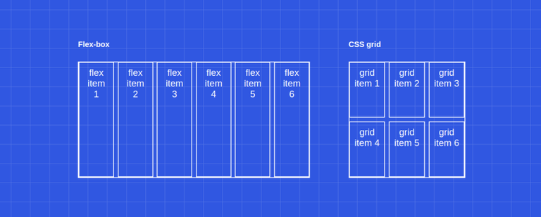
Well, CSS grid does not replace flex-box. They are two different tools for different purposes. Actually, they work very well together, we can have a flex display inside grid display and vice versa.
🌟 What are the differences between CSS grid and flex-box?
There are a lot of differences, but the main one is that flex-boxis a one-dimensional layout system whereas CSS grid is a two-dimensional layout system.
🌟 Is CSS grid production-ready?
It depends. Do you need to support: IE, Opera mini, Blackberry browser, or Baidu mobile? If the answer is no, then yes it is production-ready, if the answer is yes then you might use it anyway for the browsers that support it (unprefixed: 91.61%) using the @supports CSS at-rule:
@supports (display: grid) {
  div {
    display: grid;
  }
}
🎈Basics
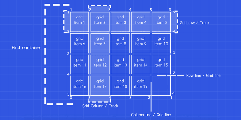
Basically, a grid could be broken down to 2️⃣ elements:
1️⃣ the grid container 2️⃣ the grid items.
🎈 CSS Properties
<div class="grid-container">
  <div class="grid-item">grid item 1</div>
  <div class="grid-item">grid item 2</div>
  <div class="grid-item">grid item 3</div>
  <div class="grid-item">grid item 4</div>
  <div class="grid-item">grid item 5</div>
  <div class="grid-item">grid item 6</div>
  <div class="grid-item">grid item 7</div>
  <div class="grid-item">grid item 8</div>
  <div class="grid-item">grid item 9</div>
</div>
Note: fr is a fractional unit, so 1fr is for 1 part of the available space.
🌟 Display
Display - display: grid;
🌟 Rows & Columns
Rows - grid-template-rows: 1fr auto 2fr;
Columns - grid-template-columns: 1fr 1fr 1fr 1fr;
Both Rows and Columns
Row/Columss - grid-template: 1fr auto 2fr / 1fr 1fr 1fr 1fr ;
🌟 Repeat function
Repeat - grid-template: 1fr auto 2fr / repeat(4, 1fr);
Repeat multiple - grid-template: 1fr auto 2fr / repeat(4, 100px 50px);
🌟 Minmax function
MinMax - grid-template: 1fr auto 2fr / repeat(4, minmax(100px, 1fr));
🌟 Gaps
Row Gap - row-gap: 5px;
Column Gap - column-gap: 10px;
Define the row-gap then the column-gap
Gap = gap: 5px 10px
If the row-gap is the same as the column-gap, we can specify only one value.
🌟 The grid items
LongHand
| Properties | Definitions |
|---|---|
| grid-row-start | The grid-row-start CSS property specifies a grid item’s start position within the grid row by contributing a line, a span, or nothing (automatic) |
| grid-row-end | The grid-row-end CSS property specifies a grid item’s end position within the grid row by contributing a line, a span, or nothing (automatic) |
| grid-column-start | The grid-column-start CSS property specifies a grid item’s start position within the grid column by contributing a line, a span, or nothing (automatic) |
| grid-column-end | The grid-column-end CSS property specifies a grid item’s end position within the grid column by contributing a line, a span, or nothing (automatic) |
ShortHand
| Properties | Definitions |
|---|---|
| grid-row | The grid-row CSS property is a shorthand property for grid-row-start and grid-row-end specifying a grid item’s size and location within the grid row |
| grid-column | The grid-column CSS property is a shorthand property for grid-column-start and grid-column-end specifying a grid item’s size and location within the grid column |
🌟 Basic template spacing
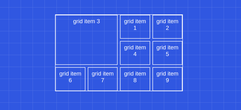
// Grid container
.grid-container {
  display: grid;
  gap: 10px;
  grid-template-columns: repeat(4, 1fr);
  grid-template-rows: repeat(3, 1fr);
}

// Grid item (third)
.grid-container .grid-item:nth-child(3) {
  grid-column-start: 1;
  grid-column-end: 3;
  grid-row-start: 1;
  grid-row-end: 3;
  // or
  grid-column: 1 / 3;
  grid-row: 1 / 3;
  // or
  grid-column: 1 / span 2;
  grid-row: 1 / span 2;
  // or
  grid-column: -5 / span 2; // because we have 4 columns
  grid-row: -4 / span 2; // because we have 3 rows
}
🌟 Advanced templating
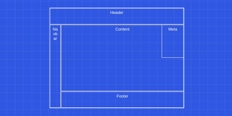
<div class="grid-container">
  <div class="grid-item header">Header</div>
  <div class="grid-item content">Content</div>
  <div class="grid-item navbar">Navbar</div>
  <div class="grid-item meta">Meta</div>
  <div class="grid-item footer">Footer</div>
</div>
.grid-container {
grid-template: repeat(6, 1fr) / repeat(12, 1fr); // rows then columns
}
.grid-container .header {
grid-column: 1 / -1;
grid-row: 1 / 2;
}
.grid-container .navbar {
grid-column: 1 / 2;
grid-row: 2 / -1;
}
.grid-container .content {
grid-column: 2 / -1;
grid-row: 2 / -2;
}
.grid-container .footer {
grid-column: 2 / -1;
grid-row: -2 / -1;
}
.grid-container .meta {
grid-column: -3 / -1;
grid-row: 2 / 4;
}
🌟 Named lines
.grid-container {
  grid-template-rows: repeat(6, 1fr);
  grid-template-columns: 1fr 1fr [content-start navbar-end] repeat(10, 1fr);
}
.grid-container .navbar {
grid-column: 1 / navbar-end;
grid-row: 2 / -1;
}
.grid-container .content {
grid-column: content-start / -1;
grid-row: 2 / -2;
}
.grid-container .footer {
grid-column: content-start / -1;
grid-row: -2 / -1;
}🎈 Element template areas
.grid-container {
  grid-template-areas:
    "h h h h h h h h h h h h"
    "n n c c c c c c c c c c"
    "n n c c c c c c c c c c"
    "n n c c c c c c c c c c"
    "n n c c c c c c c c c c"
    "n n f f f f f f f f f f";
}
.grid-container .navbar {
  grid-area: n;
}
.grid-container .content {
  grid-area: c;
}
.grid-container .footer {
  grid-area: f;
}
.grid-container .header {
  grid-area: h;
}
.grid-container .meta {
  grid-column: -3 / -1;
  grid-row: 2 / 4;
}
🎈 Implicit rows & grid flow
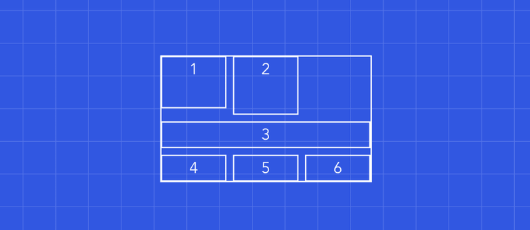
<div class="grid-container">
  <div class="grid-item">1</div>
  <div class="grid-item">2</div>
  <div class="grid-item">3</div>
  <div class="grid-item">4</div>
  <div class="grid-item">5</div>
  <div class="grid-item">6</div>
</div>
<style>
.grid-container {
  grid-template-columns: repeat(3, minmax(100px, 1fr));
  grid-template-rows: 80px;
}
.grid-container .grid-item:nth-child(2) {
  grid-row: span 2;
}
.grid-container .grid-item:nth-child(3) {
  grid-column: span 3;
}
</style>
🎈 Implicit rows
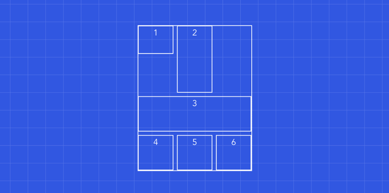
.grid-container {
  grid-template-columns: repeat(4, minmax(100px, 1fr));
  grid-template-rows: 80px;
  grid-auto-rows: 100px;
}
🎈 Grid flow
.grid-container {
  grid-auto-flow: dense; // default is row
}
